To dominate the online market, it's highly important for businesses to have a strong presence. Think of your website as an online shop window that shows off what you're all about and lets people interact with you. But here's the thing - just having a good-looking site isn't enough anymore because so many folks use their phones or tablets to go online. That’s why responsive design is key in creating a strong digital presence. In this blog, you’ll find out why responsive design is so important to your company’s website. With responsive design, websites can change how they look depending on what device someone is using. This means everything from text size to pictures and menus gets adjusted so it looks great whether you’re on a computer, phone, or tablet. It ensures visitors have a good user experience no matter how they check out your site. By making sure your website uses responsive design, you're ensuring everyone who visits has an easy time navigating around no matter their device – keeping up with our fast-moving digital world and maintaining a strong online presence for businesses big or small.
With the rise of mobile browsing, how we get information and interact with companies online has totally changed. Digital marketing is a big player behind this shift toward mobile browsing. Through targeted SEO, PPC, Email, and social media marketing, businesses can increase brand awareness, organic traffic, and conversions in both the short- and long-term. Social media sites like Facebook, Instagram, and Twitter have become really important parts of daily life for many folks who spend quite a bit of time on these platforms via their phones. This change in how people act has pushed businesses to make sure their online stuff works well on mobiles so they can connect with their audience better. When it comes to website traffic coming from mobile devices versus desktop computers - there's been a huge shift. A report by Statista showed that around 54.8% of global website visits were made through mobile devices in 2021 which was more than those made from desktops! And it looks like this trend isn't going anywhere anytime soon; making it super important for companies to ensure their websites play nice with smartphones. The development of different kinds of apps also adds fuel to the fire when talking about increased usage of mobile browsing. With tons of apps available at your fingertips, users find what they need or want much faster – adding another reason why having an app-friendly approach matters a lot for any business wanting to stay relevant today.
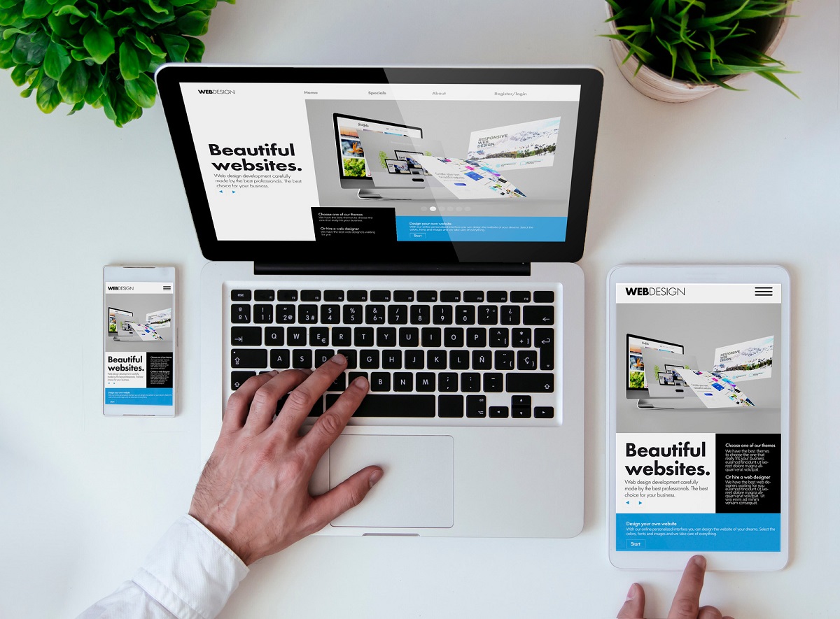
Responsive web design is all about making websites that work great and look good on any device, no matter the screen size. It's a way of building sites to make sure they automatically adjust their layout and content so everything fits perfectly on your screen, whether you're using a phone, tablet, or computer. This approach makes surfing the web easy and enjoyable for everyone by focusing on top-notch user experience across various devices during both the designing and coding phases of web development.
Responsive design ensures a website looks good on any device by adjusting its layout and content. It does this through CSS media queries, which let web developers set up different rules for how the site should look based on things like screen size and orientation. With responsive design, when someone visits a website from any device, the site's code figures out what that device is like and displays everything in the best way possible. This means no matter if you're using a phone or computer, the website will be easy to use and look great. On top of making websites more user-friendly, responsive design is super important for search engine optimization (SEO). Search engines really care about whether sites work well on mobile devices. If your site uses responsive designs, it’s more likely to show up higher in search results. This can lead to more people finding your site naturally without having to pay for ads. Additionally, incorporating responsive design into your website can also improve your SEO through techniques such as keyword research and content creation. By creating a user-friendly and visually appealing website, you can attract more customers and improve your online presence.
Improved User Experience Across Devices Making sure a website works well on all kinds of devices is super important these days. With more people using their mobile gadgets to go online, websites need to look good and work smoothly no matter the screen size or shape. This means when you visit a site on your phone, everything should fit just right without having to zoom in or scroll around too much. By focusing on making things easy and pleasant for visitors, responsive design helps businesses make a better impression online. When folks find it simple to use a website—getting around easily and finding what they need—they're likely going to stick around longer, check out more stuff, and maybe even buy something. That's great news for any business because it means people are getting into what they offer which can lead to loyal customers over time. For this magic formula of user-friendliness plus cool looks plus working perfectly across devices to happen requires teamwork from the design crew behind the scenes. It takes web designers joining forces with developers along with other team members putting their heads together so that everyone visiting has an awesome experience. Enhanced SEO Performance Having a website that looks good on all devices can really help with how well you do in search results. Search Engines like Google give extra points to websites that work well on phones and tablets, helping them show up higher when people look for stuff online. This means more folks might visit your site without you having to pay for ads. With everything looking right no matter what gadget someone's using, visitors are likely to stick around longer and not just leave out of frustration. This is great because it tells search engines your site is worth checking out, which can bump you up even higher in their lists. Plus, if your site loads quickly too, that's another bonus point towards being one of the first options people see. In short, spending some time getting responsive design right doesn’t just make your site look better; it also helps more potential customers find you through better visibility online. Mobile-First Indexing by Google Google, the main search engine, has switched gears to focus on mobile-first indexing. This means it now looks at a website's mobile version first when deciding how high it should rank. This change comes as more and more people use their phones and tablets to go online. With this new approach, Google gives extra points to sites that are easy to use on mobile devices. If your site isn't up for this challenge, you might find it slipping down in search results. Real Results: Increased Traffic and Conversion Rates By making their websites responsive, businesses have seen more people visiting and a boost in conversion rates. With a design that works smoothly on any device, it draws folks in to look around and interact with what's there. When users find the site easy to use, they stick around longer which might lead them to buy or sign up for something. Our featured projects, including Silver and Gold for Cash and Ideas Inc, are prime examples of how a website redesign can lead to increased traffic and conversion rates. On top of that, having a new website that looks good on all devices is key for marketing plans to work well. It makes sure everyone can easily access the site no matter what gadget they're using, helping companies reach out effectively to those they want as customers. This mix of smart design and solid marketing efforts leads not only to more visitors but also more people taking action on the site - both big wins for any business aiming at success through better user experience and clever marketing strategy. Embrace Responsive Design for Your Business To stay in the game, companies need to make sure their websites can adapt smoothly across various screen sizes with responsive design. Doing so not only meets Google’s requirements but also boosts your chances of climbing higher in rankings by offering a better user experience. For businesses aiming to keep up with online trends and reach out effectively to their audience, making responsive design a priority is key. If you’d like to speak to a website consultant, you can reach us at (866) 665- 2677.